Responsive Web Design is a design done with CSS3 Media Queries that change according to the visitor’s environment. In other words, the design “responds” to changes.
It may sound like science-fiction, but that’s what happens. And it’s not complicated as it sounds. It’s actually easy to create a basic Responsive design. All you need to do is play a little with CSS3 Media Queries and set different widths for container elements.
How?
HTML4 and CSS2 currently support media-dependent style sheets, like different style sheets for screen and print.
<link rel="stylesheet" type="text/css" media="screen" href="screen.css">
<link rel="stylesheet" type="text/css" media="print" href="print.css">
Media Queries is a concept similar to this, except it enables us to detect the features of users’ devices, like, screen size, height, resolution aspect ratio etc. We can then write specific CSS for a certain screen size, for example.
This way if the user switches to another device, like his/her Android phone, for example, the website detects the screen size of the device and automatically resizes or even hides some content to provide the user with the best viewing experience.
OK, let’s make a responsive design for a simple blog site.
Features
We’ll create a simple HTML and CSS for an arbitrary blog site. The design will contain a header, footer, content and right sidebar. Pretty much standard stuff. Also, we’ll make the footer stick to the bottom of the page. To do this we’ll use a great Sticky Footer solution by Ryan Fait.
Let’s get started. The first thing we’ll need is HTML.
The HTML
I guess you know all about HTML, so I’m not gonna bore you with details. We’ll use HTML 5 doctype and elements. Everything should be pretty straightforward.
<!DOCTYPE html> <html> <head> <meta charset="utf-8" /> <meta http-equiv="Content-Language" content="en-us" /> <title>Introduction to Responsive Web Design</title> <meta name="viewport" content="width=device-width, initial-scale=1.0" /> <link href="style.css" rel="stylesheet"> </head> <body> <!-- Outer Start --> <div id="outer"> <!-- Wrap Start --> <div id="wrap"> <header id="page_header"> <hgroup> <h1>Astronomy & Physics</h1> <h2>Somewhere, something incredible is waiting to be known. Carl Sagan</h2> </hgroup> </header> <nav> <ul id="menu"> <li><a href="home.html">Home Page</a></li> <li><a href="blog.html">Blog</a></li> <li><a href="contact.html">Contact</a></li> </ul> </nav> <div class="clear"></div> <!-- Sidebar Start --> <div id="sidebar"> <aside class="box"> <h1>Aside 1</h1> </aside> <aside class="box"> <h1>Aside 2</h1> </aside> </div> <!-- Sidebar End --> <!-- Content Start --> <div id="content"> <h1>Content</h1> </div> <!-- Content End --> <div class="push"></div> </div> <!-- Wrap End --> <footer id="page_footer"> <h1>Footer</h1> </footer> </div> <!-- Outer End --> </body> </html>
The first thing you might find strange is the use of the viewport meta tag:
<meta name="viewport" content="width=device-width, initial-scale=1.0" />
This meta tag simply ensures that Phones and Tablets respect the values in the media queries. For more information about viewport tag I suggest you read the intro on Mozilla Development Network
I’m guessing you understand everything else. We use standard divs for formatting the large website sections, like content and sidebar and we use HTML5 elements where they’re appropriate. We do it like this because it’s not valid to use a section to wrap content in order to style it.
Adding some content in HTML
Now let’s add some content into HTML, just to make the site look a bit more real. First, let’s change the sidebar:
<!-- Sidebar Start -->
<div id="sidebar">
<aside class="box">
<h1>Great Quotes</h1>
<p>
Although I cannot move and I have to speak through a computer,
in my mind, I am free. Stephen Hawking.
</p>
</aside>

<aside class="box">
<h1>Lepton</h1>
<p>
The best known of all leptons is the electron which governs nearly all of chemistry
as it is found in atoms and is directly tied to all chemical properties. Two main
classes of leptons exist: charged leptons (also known as the electron-like leptons),
and neutral leptons (better known as neutrinos).
</p>
</aside>
</div>
<!-- Sidebar End -->
And now for the content section:
<!-- Content Start --> <div id="content"> <article> <header> <h1>Black hole</h1> <p> Published on: <time datetime="2012-03-31">March 31<sup>st</sup> 2012.</time> </p> </header> <img class="blog_intro" src="images/black_hole.png" width="200" alt="Simulated view of a black hole" /> <p>From Wikipedia, the free encyclopedia</p> <p> A black hole is a region of spacetime from which nothing, not even light, can escape.[1] The theory of general relativity predicts that a sufficiently compact mass will deform spacetime to form a black hole. Around a black hole there is a mathematically defined surface called an event horizon that marks the point of no return. It is called "black" because it absorbs all the light that hits the horizon, reflecting nothing, just like a perfect black body in thermodynamics.[2] Quantum mechanics predicts that black holes emit radiation like a black body with a finite temperature. This temperature is inversely proportional to the mass of the black hole, making it difficult to observe this radiation for black holes of stellar mass or greater. </p> <p><a href="http://en.wikipedia.org/wiki/Black_hole">Continue reading</a></p> </article> <article> <header> <h1>Schrödinger's cat</h1> <p> Published on: <time datetime="2012-03-29">March 29<sup>th</sup> 2012.</time> </p> </header> <img class="blog_intro" src="images/cat.png" width="200" alt="Lorentz factor as a function of speed" /> <p>From Wikipedia, the free encyclopedia</p> <p> Schrödinger's cat is a thought experiment, sometimes described as a paradox, devised by Austrian physicist Erwin Schrödinger in 1935. It illustrates what he saw as the problem of the Copenhagen interpretation of quantum mechanics applied to everyday objects. The scenario presents a cat that might be alive or dead, depending on an earlier random event. Although the original "experiment" was imaginary, similar principles have been researched and used in practical applications. </p> <p><a href="http://en.wikipedia.org/wiki/Schr%C3%B6dinger%27s_cat">Continue reading</a></p> </article> <article> <header> <h1>Quantum gravity</h1> <p> Published on: <time datetime="2012-03-27">March 27<sup>th</sup> 2012.</time> </p> </header> <img class="blog_intro" src="images/higgs_event.png" width="200" alt="Simulated Large Hadron Collider CMS particle detector data" /> <p>From Wikipedia, the free encyclopedia</p> <p> Quantum gravity (QG) is the field of theoretical physics which attempts to develop scientific models that unify quantum mechanics (describing three of the four known fundamental interactions) with general relativity (describing the fourth, gravity). It is hoped that development of such a theory would unify into a single consistent model all fundamental interactions and to describe all known observable interactions in the universe, at both subatomic and cosmological scales. </p> <p><a href="http://en.wikipedia.org/wiki/Quantum_gravity">Continue reading</a></p> </article> </div> <!-- Content End -->
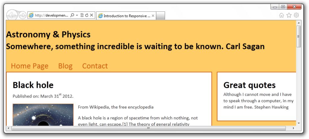
OK, that’s done! Our website now looks like this:
You might wonder why images don’t have a height specified. That’s because omitting height will enable us to scale the images on smaller screens.
Now the FUN part. The CSS. First, let’s do some basic styling to make our website look better, and then we’ll do media queries.
Basic Styling and Layout
Create the file style.css. As we all know, a good CSS should start with a CSS Reset. Why?
CSS Reset
CSS Reset removes browser-predefined styles for HTML elements. Now our styles should behave consistently across all browsers. For this task you can use either: Eric Meyer’s CSS Reset or CSS Reset from Yahoo.
In this example, I’m using a modified old Yahoo CSS Reset.
/* Basic Reset */
body,div,dl,dt,dd,ul,ol,li,h1,h2,h3,h4,h5,h6,pre,form,fieldset,input,textarea,p,blockquote,th,td {
margin:0;
padding:0;
}
table {
border-collapse:collapse;
border-spacing:0;
}
fieldset,img {
border:0;
}
address,caption,cite,code,dfn,em,strong,th,var {
font-style:normal;
font-weight:normal;
}
ol,ul {
list-style:none;
}
caption,th {
text-align:left;
}
h1,h2,h3,h4,h5,h6 {
font-size:100%;
font-weight:normal;
}
Some might say it’s excellent. It’s ready for us to style it, kinda like an undiscovered country that’s ready to be claimed. 🙂
General styling
Let’s apply some style to our page, and make it look like something. First, some general styling. We need to add it behind the CSS Reset.
/* General */
article, aside, footer, header, hgroup, nav, section {
display: block;
}
html {
font-size: 100%;
height: 100%;
}
body {
margin: 0;
font-family: Calibri, Verdana, sans-serif;
font-size: 16px;
line-height: 21px;
color: #333;
background-color: #ffcc66;
height: 100%;
}
sup {
top: -10px;
}
img {
max-width: 100%;
height: auto;
border: 0;
}
h1,h2 {
font-weight: bold;
color: #000;
}
h1 {
font-size: 32px;
line-height: 42px;
}
h2 {
font-size: 30px;
line-height: 38px;
}
p {
margin-bottom: 15px;
}
a {
color: #993300;
text-decoration: none;
}
a:hover {
color: #d36111;
text-decoration: underline;
}
img.blog_intro {
border: 1px solid #d36111;
float: left;
margin-right: 15px;
}
First thing worth mentioning is the image style.
img {
max-width: 100%;
height: auto;
border: 0;
}
Using max-width: 100%; we ensure every image is loaded in its original size until the screen becomes smaller than the image. So when the screen becomes smaller, so does the image.
However, images are rather a complex part of making a responsive design, so we won’t get into that in this basic example.
There are other things that are somewhat interesting. First, we said:
article, aside, footer, header, hgroup, nav, section {
display: block;
}
This is simply for older browsers’ benefit. We tell them to display HTML 5 elements as block-level elements. Second, we defined height on HTML and BODY elements. This is needed for a sticky footer. As we all know boxes have their heights relative to their parents, that’s why we have to give them height.
Creating the layout
We’ll make a two-column layout with the sticky footer. We’ll have an outer div that contains everything. This way it’s really simple to change sizes.
The wrap div contains sidebar and content divs. Behind the wrap, there’s a footer and a push div that pushes down the footer.
/* Boxes */
#outer {
width: 980px;
margin: 0 auto;
}
#wrap {
height: auto !important;
min-height: 100%;
position: relative;
margin: 0 auto -220px auto;
}
#page_header {
padding: 25px 0;
}
#content {
width: 640px;
padding: 20px;
background: #FFF;
border: 2px solid #d36111;
}
#sidebar {
width: 280px;
float: right;
}
#page_footer {
position: relative;
bottom: 0;
height: 140px;
padding: 20px;
margin-top: 40px;
background-color: #FFF;
border: 2px solid #d36111;
border-bottom: 0;
clear:both;
}
.box {
background-color: #FFF;
border: 2px solid #d36111;
margin-bottom: 25px;
padding: 20px;
}
.push {
height:220px;
}
.clear {
clear: both;
}
/* Menu */
#menu li {
display: inline;
}
#menu li a {
float: left;
font-size: 27px;
display: block;
padding: 10px 16px;
color: #d36111;
}
#menu li a:hover {
color: #2f87e7;
text-decoration: none;
}
I trust you understand everything. One thing you should notice and be careful with is to have the negative margin on the wrap the same as the height of footer push.
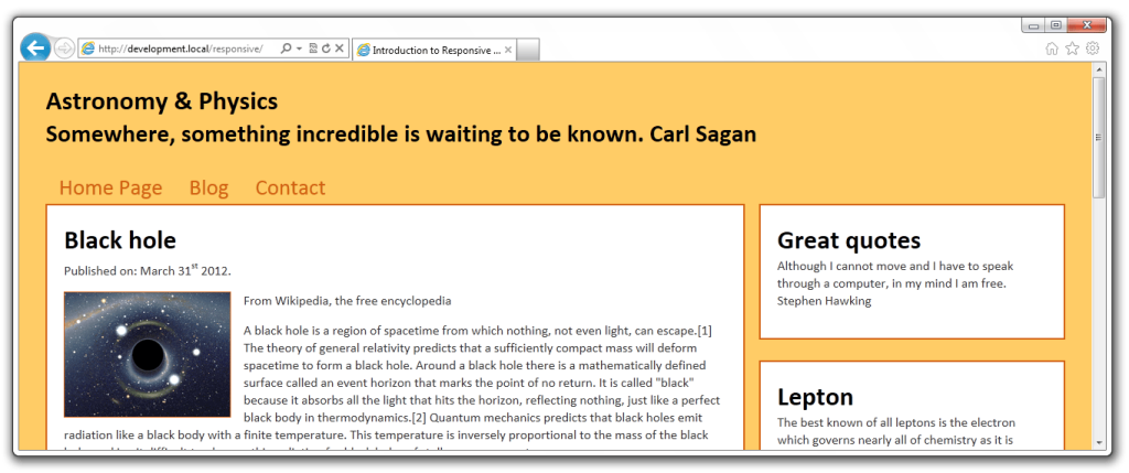
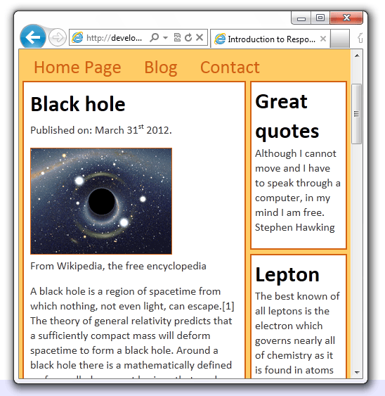
Refresh the page to see what we got:
Great, now that this is done it’s finally time to make our site responsive using CSS Media Queries.
Responsive design
As we already established Responsive Design is based on media queries. Media Query “consists of a media type and zero or more expressions that check for the conditions of particular media features.” – from W3C.
Media Query has a syntax like:
@media (property) {
/* CSS Styles */
}
So if the user comes to our site with a device which satisfies the condition in the media query the CSS Styles inside a query are applied to elements of our website. Another thing is that there can be multiple media queries inside a single CSS file. Also, media queries can be combined.
Let’s make a simple media query for users with large displays. Insert the following at the end of our CSS file:
/* Large displays */
@media (min-width: 1250px) {
#outer {
width: 95%;
max-width: 1400px;
}
#content {
width: 65%;
}
#sidebar {
width: 30%;
}
}
This is an example of the min-width property. It’s simple to understand min-width. It sets the minimum width of the screen (or browser window) to which the styles should be applied. If the window or screen size is smaller this rule will simply be ignored. If you have a large display refresh the page and you should see the layout expand to 95% or the maximum of 1400px.
Also, don’t forget to try and resize your browser window to see what happens. The layout should be fluid until you reach the previously specified 980px width to the outer div.
Now, let’s add some more media queries, for smaller devices, such as Tablets and Smartphones.
Tablet & Smartphone media queries
Simply by Googling or Binging, we can find some common screen sizes of tablets and smartphones and then use those values in our media queries. Let’s do tablets first:
/* Landscape tablets */
@media (min-width: 768px) and (max-width: 979px) {
#outer {
width: 95%;
}
#content {
width: 69%;
padding: 2%;
}
#sidebar {
width: 25%;
}
.box {
padding: 5%;
margin-bottom: 5%;
}
}
/* Portrait tablets */
@media (max-width: 767px) {
#outer {
width: 98%;
}
#content {
width: 64%;
padding: 2%;
}
#sidebar {
width: 30%;
}
img.blog_intro {
float: none;
margin: 0;
}
.box {
margin-bottom: 4%;
padding: 4%;
}
}
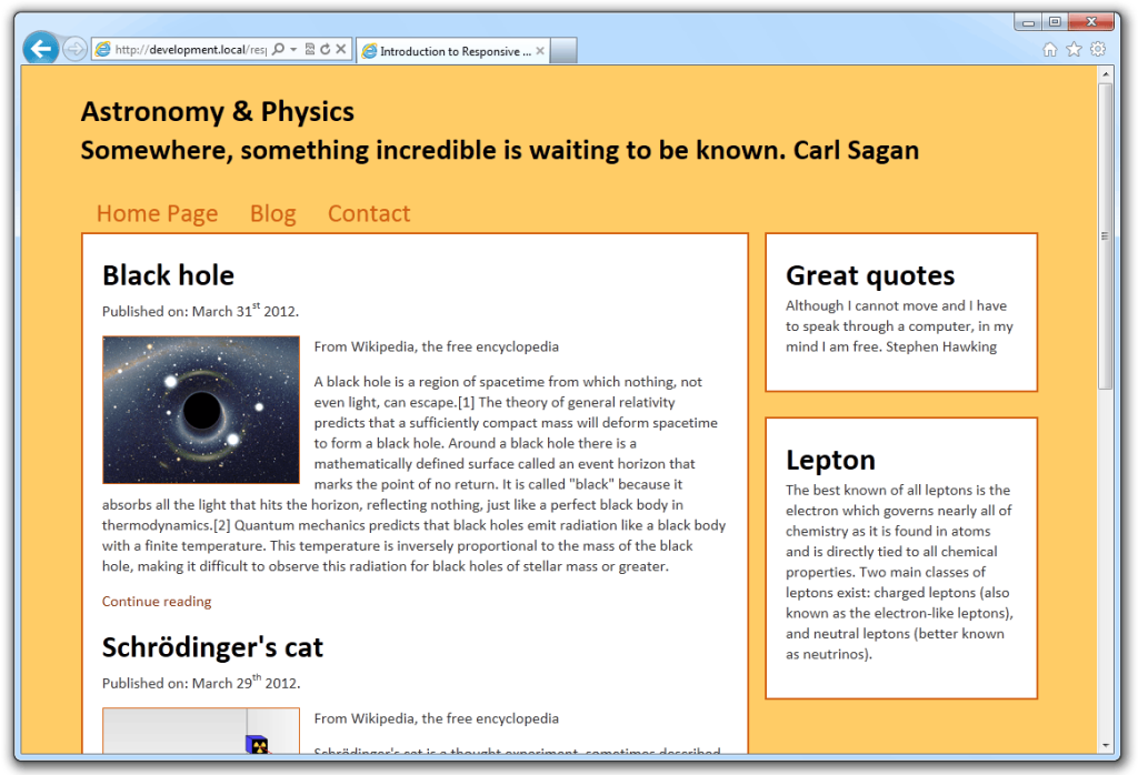
Landscape Tablets
The first query specifies the size of tablets with landscape orientation. So, the CSS styles apply to displays with at least 768px width and a maximum of 979px. If the screen size is under 768px and over 979px the styles will be ignored.
The entire outer div now takes up 95% of the entire screen. We also override the content div’s default padding of 20px with 2%. At this screen size, we decided that 25% of the outer div’s width is enough for a sidebar, so we have more room for the content div.
Additional
Remember, sometimes holes can appear between your media queries. When that happens there might be screen widths not covered with media queries and as a result, a horizontal scrollbar may appear. Those may come from the browser’s vertical scrollbar as well. In this example there’s one hole, between default styles and tablets:
So, if you don’t want any scrollbars ever, be sure to detect and eliminate those holes:
/* Hole */
@media (max-width: 995px) {
#outer {
width: 98%;
}
#content {
width: 63%;
}
#sidebar {
width: 30%;
}
}
NOTE: of course, we could write better default CSS to exclude those possibilities to begin with, but that’s not really a point. The point is to learn about media queries and what they do. Real-world implementation should, of course, be planned.
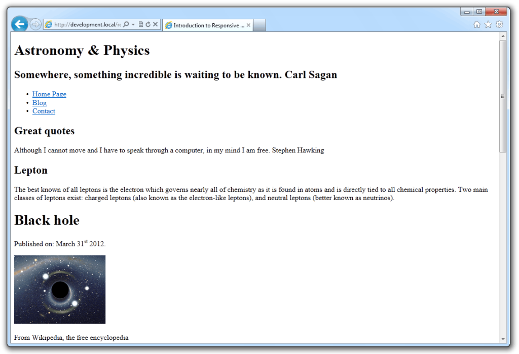
Portrait Tablets
This media query applies to screens with a maximum width of 767px. On this screen size and lower, we decided to take 98% of the screen for the outer div, and reduce the content div a little to make more room for the sidebar which we decided would be useless without at least 30% of the outer’s width.
We also disabled float on the blog intro image, so the image now simply goes beneath the heading.
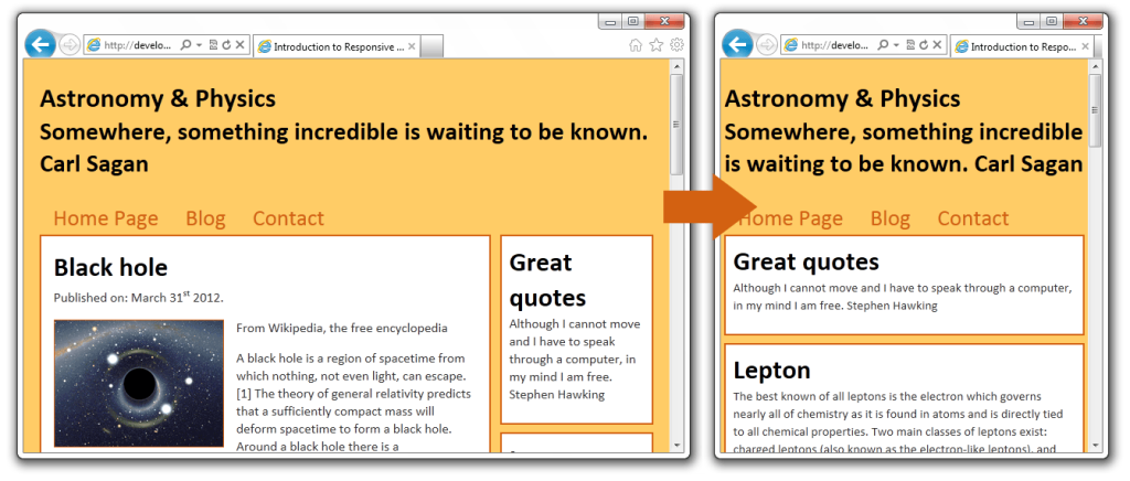
But, even all this saving of screen space would not help us much if a visitor came on the site using a smartphone. So, let’s deal with that situation.
Smartphone media query
For smartphones, we decided we won’t have two layout columns, but one. That means the sidebar will no longer be a sidebar, but instead, it’ll be located above the content.
To do that, we’ll simply say: if the screen size is below 480px apply these styles:
/* Smartphones */
@media (max-width: 480px) {
html {
-webkit-text-size-adjust: none;
}
body {
font-size: 95%;
}
#outer {
width: 98%;
}
#content {
float: none;
width: auto;
margin: 0;
padding: 2%;
}
#sidebar {
float: none;
width: auto;
margin: 0;
}
#page_footer {
position: static;
margin-top: 2%;
padding: 2%;
}
.box {
padding: 2%;
margin-bottom: 2%;
}
}
The first thing you might find strange is:
html {
-webkit-text-size-adjust: none;
}
Well, this is because iPhone automatically adjusts text size, so we tell it not to do that. However, you should be very careful about using this property in real life. Always make sure to TEST your layout.
Conclusion
Media queries are a great technology which enables us to create responsive designs that adapt to visitors.
This way instead of creating a different web for mobile users our existing web behaves differently, providing mobile users (and even those not browsing with maximized windows) with a better user experience.
With this article, we have done some basic media queries and we created a basic responsive design, but there’s more to it. For example, we can have mobile users download smaller versions of images and save the bandwidth that way. But this is a subject for another article. Important thing is that we scratched the surface.
Additional reading
- Media Queries
- Responsive Web Design
- Responsive Web Design: What It Is and How To Use It
- 11 reasons why Responsive Design is not that cool!
If you have any comments, suggestions or code samples to share, feel free to use the comment form. Also, what do you think we should cover next in the field of Web Design?