Finally, the time has come for another Blog entry, cool and breezy, just right for the summertime. We’re going to do some XHTML/CSS Tips and Tricks you may or may not know. Either way, it’ll be a quick and simple post, just long enough for you to do the coding while enjoying a nice cold beer. 🙂
1. Couple of CSS border tricks
1.1. Simple separator using borders
Probably the most used border trick which creates a simple, nice-looking content separator for us. Here is the HTML:
<div style="padding: 20px; background-color: #6d6e6d;">
    <div class="separator"> </div>
</div>
CSS is very simple, and goes like this:
.separator {
    font-size: 0;
    line-height: 0;
    border-top: 1px #1f1f1f solid;
    border-bottom: 1px #c5c5c5 solid;
}
code gives us a nice looking simple separator for our content:

All that is left to do is to play with border colours for the desired effect (and adjust margins as needed).
1.2. Fast „double border” trick
Two borders on an image using only img tag and no extra div:
<div style="padding: 20px; background-color: #6d6e6d;">
    <img src="golf.jpg" class="double-border" width="600" height="279" alt="Sveti Martin, golf, hotel and wellness" />
</div>
The CSS:
.double-border {
    border: 2px solid #595959;
    padding: 1px;
    background-color: #000000;
}
It’s really very simple. We use the padding and background colour to add the extra black border. Together with the background div, this gives us nice results:
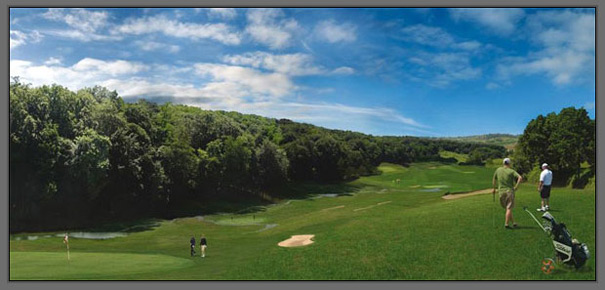
All Croatia images © Croatian National Tourist Board
1.3. Photo-like border using simple CSS
It’s a simple trick which uses borders of different sizes and colours to simulate photography-like borders:
<img src="golf.jpg" class="photo-border" width="600" height="279" alt="Sveti Martin golf, hotel and wellness" />
Again simple CSS just for the image, and no need for additional divs:
.photo-border {
    background-color: #FFFFFF;
    padding: 5px;
    border-style: solid;
    border-width: 1px 2px 2px 1px;
    border-color: #cccccc #666666 #666666 #cccccc;
}
This gives us a nice border around the image:
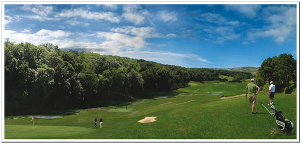
See? Very simple CSS and the effect is pretty good. Play with colours and padding to customize borders more to your liking.
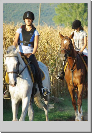
1.4. Polaroid effect – 3 ways to do it
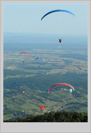
Let’s now do the polaroid effect using 3 different techniques. First, let’s keep it simple and use only CSS. The HTML:
<img class="polaroid-border" src="flying.jpg" width="286" height="400" alt="Croatia Jastrebarsko" />
The CSS:
.polaroid-border {
    padding: 10px 10px 35px 10px;
    background-color: #cccccc;
    border: 1px #999999 solid;
}
The result:
Simple, huh? However, we could use a background image to simulate the border shadow and get better results:
.polaroid-png-border {
    padding: 10px 15px 45px 10px;
    background: #fff url(’png-shadow.png’) right bottom;
}
The second result:
Of course, we can use some properties we will find in CSS3 to add the shadow. First, we add our polaroid-border class to an image, and then box-shadow:
.polaroid-border {
    padding: 10px 10px 35px 10px;
    background-color: #eee;
    border: 1px #dbdbdb solid;
}

.box-shadow {
    -moz-box-shadow: #666666 3px 3px;
    -webkit-box-shadow: #666666 3px 3px;
}
Box shadow property is visible in Firefox and Safari only and if you use it you will get a CSS error on the W3 CSS Validation service. If that’s not a problem for you just go ahead and use it. Luckily, the box-shadow property will be part of the upcoming CSS3.
The preview:
2. Few more miscellaneous CSS tips
2.1. Box-size problems with added padding
As you undoubtedly noticed getting the dimensions of an individual box can get tricky when you add margins and padding to the play. For example, if we made a CSS box with a width of 500px and 20px padding for each side the actual width of the box is 540px because the padding gets added to the width of the box. To get exactly a 500px box we need to make the width property 460px and padding 20px so it evens out at 500px. However, there is a simple solution that will save you a lot of headaches with calculating dimensions.
Why not simply add another div inside our box and apply padding to it? That way we can add padding and margins to it all we want and it won’t mess up our original box. Observe:
<div class="box">
    <div class="padding">
        <p>Lorem ipsum dolor sit amet, consectetur adipiscing elit. Cras eget sapien quis dolor rhoncus elementum.
        Vestibulum quis urna nibh, sed sollicitudin ipsum. Nulla quis nisl tortor. In volutpat rutrum pulvinar.</p>
    </div>
</div>
.box {
    width: 500px;
    border: 2px #663399 solid;
    background-color: #945dcb;
}

.padding {
    padding: 20px 30px;
    margin: 10px;
    border: 1px #8a4fc5 solid;
    background-color: #A375D1;
}
Now we can play with the padding, and margins of the inside box anyway we want and our outside box has the same width. We can even style the inside box if we want. Notice, only the padding of the inside box is changed.
2.2. Drop Cap with CSS
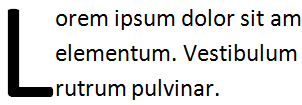
What is a „drop cap”? A drop cap is simply a first letter of a paragraph which spans 2 or more lines. Simply put, it’s enlarged to drop down 2 or more lines. You often see it at the beginning of an article.
So how do we make it using HTML & CSS?
We could simply add an appropriate CSS class to the first letter, but it’s more intuitive to use : first-letter pseudo-element. Observe:
<p>
    Lorem ipsum dolor sit amet, consectetur adipiscing elit. Cras eget sapien quis dolor rhoncus elementum.
</p>

<p>
    Cras eget sapien quis dolor rhoncus elementum. Vestibulum quis urna nibh, sed sollicitudin ipsum.
</p>
The CSS with the first-letter pseudo-element:
p:first-letter {
    float: left;
    font-size: 300%;
}
This way all the <p> element’s first letter is styled the way we want. Of course, you can use it on divs, LIs etc. Pretty interesting, huh?
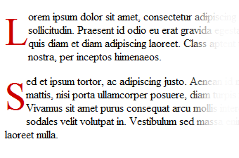
There is also something called the pseudo-class. Using pseudo-classes we can add certain properties only to the first instance of an element. For example, we can make only the first paragraph red:
p {
    font: normal 1.5em Georgia, Times, serif;
    color: #000;
}

p:first-child {
    color: red;
}
However, first-letter is not the only pseudo-element. There’s also first-line for instance, which as you have guessed we could use to style the entire first line. Or we can combine pseudo-elements and pseudo-classes to have only the first letter of a first paragraph „dropped”:
p:first-child:first-letter {
    float: left;
    font-size: 300%;
}
I hope to bring more CSS snippets using pseudo-elements and classes. If you’re interested in learning more I suggest you visit our good friend W3C for a proper reading about the subject.
2.3. CSS for Internet Explorer
Ok, we all know Internet Explorer has its problems. While Internet Explorer 8 is pretty good at rendering CSS in HTML documents while in Standards mode lot of people still use older versions like 6 or 7 which are a lot less advanced. This is especially true for Internet Explorer 6 which has some big issues with CSS. The solution can be to make a stylesheet with appropriate fixes and serve it only to Internet Explorer 6 or below.
To do that we don’t need any server-side scripting or JavaScript, all we need are some conditional comments. How do conditional comments work? Simply, they are processed by Internet Explorer and ignored by other browsers. We can use these to provide specific CSS files to Internet Explorer:
Conditional comments for CSS go in the <head> section of our page. For example, to target all versions of Internet Explorer:
<head>
<!--[if IE]>
    <link rel="stylesheet" type="text/css" href="internet-explorer.css" />
<![endif]-->
</head>
As you can see these are regular HTML comments with an if-expression. If the user’s browser is Internet Explorer it will process included stylesheet, otherwise, it will ignore it. Now let’s have some additional examples of Internet Explorer Conditional Comments.
Internet Explorer 7 stylesheet:
<!--[if IE 7]>
    <link rel="stylesheet" type="text/css" href="internet-explorer-7.css" />
<![endif]-->
Stylesheet for Internet Explorer 5 and higher (gte -> greather-than or equal):
<!--[if gte IE 5]>
    <link rel="stylesheet" type="text/css" href="internet-explorer-5.css" />
<![endif]-->
Internet Explorer 7 and lower (lte -> lower-than or equal):
<!--[if lte IE 7]>
    <link rel="stylesheet" type="text/css" href="internet-explorer-6.css" />
<![endif]-->
More extereme example – version higher than 5 and lower than 8
<!--[if (gt IE 5)&(lt IE 8)]>
    <link rel="stylesheet" type="text/css" href="internet-explorer-6-7.css" />
<![endif]-->
Of course, you can use the conditional comments for any content, it doesn’t have to be CSS. It could be scripts, images, or anything. The complete guide is available on Microsoft’s MSDN Website, but I bet you understood the syntax immediately if you’re not on your third or fourth beer, that is. 🙂
And we’re done! Sorry about the long delay between blog posts, but it’s not like the site didn’t progress at all. Now you can rate the posts, or sign up using your Twitter or Facebook accounts.
That’s it my friends, thank you very much for reading and visiting. Stay tuned!