Hello again! This time we are going to do some PSD to XHTML/CSS, meaning we will make a fully functional web page from a template we created in Photoshop. For this tutorial, I created a very simple web page template which you can download in PSD format. It isn’t very original-looking either, but it will serve its purpose. And of course, you can use it in any way (except of course altering the Croatia images or claiming them as your own).
Because this is a walkthrough we will go one step at a time so you can understand what is happening at each stage, rather than just giving you the final HTML and then a final CSS and letting you figure out yourself what each div or CSS property is for.
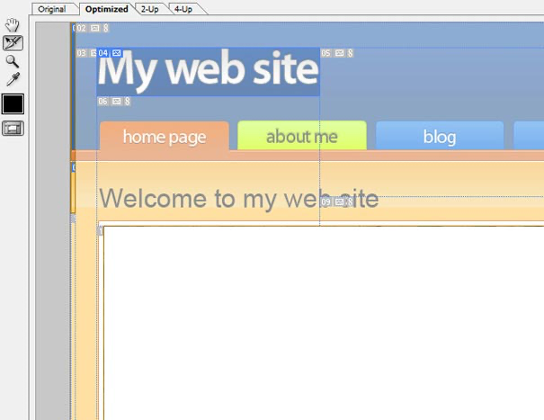
Anyway, here is a preview of what we’ll be creating:

1. Analysing the PSD
- Header
- Menu (Navigation)
- Wrap (Content & Sidebar)
- Footer
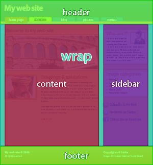
As you can see, we have classic 2 columns for our “Wrap”. So, we can divide our Wrap area into 2 parts:
- Content part
- Sidebar part
By analysing the PSD you can also see that our page will need the following features so it looks and acts good:
- Header, footer & wrap backgrounds extend for the entire width of the viewport
- A page centred in the viewport
- The footer always sticks to the bottom of the page
- The menu contained in CSS Sprite image
So, let’s get into it:
2. Creating the basics needed for slicing
Open your favourite editor and create an HTML file. Let’s create a basic layout. We will add additional markup needed for menus, content and sidebar later.
<!DOCTYPE html PUBLIC "-//W3C//DTD XHTML 1.0 Strict//EN" "http://www.w3.org/TR/xhtml1/DTD/xhtml1-strict.dtd">
<html xmlns="http://www.w3.org/1999/xhtml">

<head>
<meta content="text/html; charset=utf-8" http-equiv="Content-Type" />
<title>My web site</title>
</head>

<body>

<!-- main div -->
<div id="outer">

<!-- header -->
<div id="header">header</div>

<!-- wrap -->
<div id="wrap">wrap</div>

<!-- footer -->
<div id="footer">footer</div>

</div>

</body>

</html>
Now we have a basic HTML layout for our site. Now let’s do some basic CSS formatting of our layout, including sticking a footer at the bottom of the page.
Create a CSS and include it in the head section of your HTML document:
<link href="style.css" rel="stylesheet" type="text/css" media="screen" />
First, we are going to reset the CSS. CSS Reset removes browser-predefined styles for HTML elements. Now our styles should behave consistently across all browsers. For this task, you can use either: Yahoo’s CSS Reset or Eric Meyer’s CSS Reset. In this example, I used modified Yahoos. So let’s reset the CSS:
body,div,dl,dt,dd,ul,ol,li,h1,h2,h3,h4,h5,h6,pre,form,fieldset,input,textarea,p, blockquote,th,td {
margin:0;
padding:0;
}
fieldset,img {
border:0;
}
address,caption,cite,code,dfn,em,strong,th,var {
font-style:normal;
font-weight:normal;
}
ol,ul {
list-style:none;
}
h1,h2,h3,h4,h5,h6 {
font-size:100%;
font-weight:normal;
}
Now let’s make some basic adjustments and styling, including making our footer stay on the bottom of the page. How it works you ask? First, we must set the height of the HTML and body to 100%. The outer div then has 100% height even if the page is empty. It has position: relative property which enables us to absolutely position the footer inside it. For further reading about the footer issues I recommend you consult the Internet 🙂 For example: Get down! How to keep footers at the bottom of the page or Footers on fortysevenmedia or maybe A List Apart on footers or simply google it and have fun! 🙂
Anyway, I got a little bit carried away with the footers. Just add the following CSS behind our reset:
html {
height: 100%;
}

body {
height: 100%;
}

#outer {
min-height: 100%;
position: relative;
background: #ffcc66;
font-size: 1em;
}

#header {
background: #446b9a;
height: 160px;
}

#wrap {
padding-bottom: 200px;
}

#footer {
position: absolute;
bottom: 0;
width: 100%;
height: 125px;
background: #d36111;
}
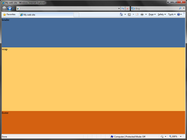
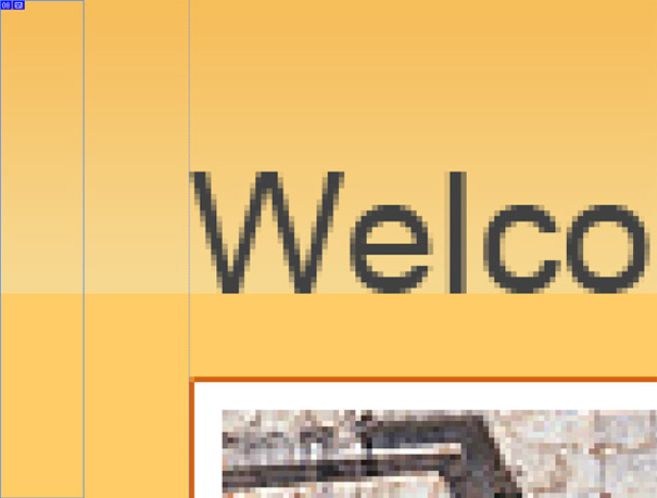
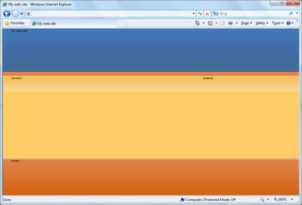
We get a basic layout with our footer always at the bottom. It should look like this:
Now, as we said before, we need the web page actually centred in the viewport of the browser. At the same time, we can divide the wrap area into two parts we mentioned earlier, namely content and sidebar.
To do that, let’s first change HTML for the header, and footer and wrap a bit. Inside each add a new div with a container class, and for wrap add two additional divs for content and a sidebar.
<!-- header -->
<div id="header">
<div class="container">
<h1>My web site</h1>
</div>
</div>

<!-- wrap -->
<div id="wrap">
<div class="container">
<div id="content">content</div>
<div id="sidebar">sidebar</div>
<div class="clear"></div>
</div>
</div>

<!-- footer -->
<div id="footer">
<div class="container">footer</div>
</div>
Now let’s just modify our CSS a little bit to centre the page and to create our 2 columns. Add the following to CSS:
.container {
width: 960px;
margin: 0 auto;
}

#content {
float: left;
width: 630px;
margin-right: 30px;
}

#sidebar {
float: left;
width: 300px;
}

.clear {
clear: both;
}
And that’s it. Now for the fun part: slicing and adding content!
Note: We are going to add the menu later because it is done with CSS Sprites and adding those now would just complicate things, especially for beginners. So let’s just focus on slicing and adding the content and simple things now, and we will be adding the menu later. Ok? I know it is! 🙂
3. Slicing a template
Open Photoshop and prepare to slice and dice our template. Imagine, for slicing we are going to use the Slice tool! If you downloaded the source I recommend you use the PSD without slices and make them yourself.
Grab a slice tool, zoom in on our design enough so that we can slice with precision and start slicing. First, we need backgrounds for the header, wrap and footer.
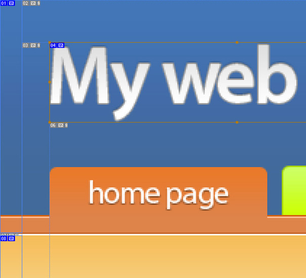
When slicing the background for the header and wrap don’t include the borders, because it is more flexible to add them via CSS. Also when slicing the footer you will need to include an extra 1px of white (first border). Alternatively, you could make another div inside the footer with the necessary borders. When working on the header make an orange menu-line part of the header too, because it’s simpler. Consult the samples when needed.
When slicing a background for the wrap be sure to slice to the point where the gradient ends and solid colour (our #ffcc66) begins. We can use the eyedropper tool to check for that place.
When we finish with the backgrounds for the wrap, header and footer, we can slice the background for boxes on the sidebar. Now we have finished with the backgrounds. Time for images we will use for content. Do not slice borders and spaces around the images, because we will add them via CSS. Now just slice Social icons and we’re done!
By the way, don’t forget to save the PSD as you are slicing. And don’t worry about Photoshop adding unneeded slices, we will only save those we need.
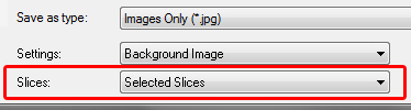
Now when we’re done, it is time to save the slices we need for coding our design. First, let’s save slices for which we don’t need transparent backgrounds, such as the main image, blog image and gradients for the header, footer and wrap:
Go to File -> Save for Web and Devices and using Slice select tool and shift key select the needed slices:
Then click save. On the next screen make sure to select the option to save only selected slices. Of course, we could save all slices and then delete those we don’t need, but this is more convenient.
Now it is time to save the slices with transparent backgrounds. Those are the Social icons, the Logo in the header, and the “Who am I” icon. To do this first hide all the backgrounds beneath said elements, and then go to File -> Save for Web and Devices.
Same deal here as before, except we need to select PNG-24 as our format of choice so that our transparency is preserved and that we can use those images on a background without ugly side pixels. So we are aiming for a smooth look.
And we’re finished with slicing! Just remember to name the images you save according to their position in the design. Now we are going back to adding content and coding our HTML and CSS files.
Note: As I mentioned earlier, there is no need to slice the menu now, we will add it later and from a different file.
4. Styling our layout using background images
Now, let’s style our layout with appropriate background images and see how it looks. But first, let’s set some other useful things we’ll need later, such as font size and family for the body. So let’s modify our bodies a bit:
body {
height: 100%;
font-size: 62.5%; /* when this is set -> 1em = 10px */
font-family: Arial, Helvetica, sans-serif;
}
And now, let’s quickly style our layout with background images and borders:
#header {
height: 160px;

background: #446b9a url('images/header-bg.jpg') repeat-x;
border-bottom: 1px #c66528 solid;
}

#wrap {
padding-bottom: 200px;

background: #ffcc66 url('images/wrap-bg.jpg') repeat-x;
border-top: 1px #ffffff solid;
}

#footer {
position: absolute;
bottom: 0;
width: 100%;
height: 125px;

background: #de834a url('images/footer-bg.jpg') repeat-x;
border-top: 1px #d36111 solid;
}
Here’s what our layout should look about now:
Ok, time to add the content inside our HTML file, so we can style it later.
5. Adding content to our HTML file
The content div (left side of wrap) of our HTML file looks like this:
<div id="content">content</div>
So, let’s add texts and images from our design to it. Open your HTML file and edit your content div:
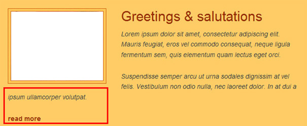
<!-- start content --> <div id="content"> <h1>Welcome to my web site</h1> <img class="photo" src="images/pula.jpg" width="618" height="227" alt="Roman Amphiteather in the city of Pula" /> <div class="blog"> <a href="#" class="post-photo"><img src="images/alkar.jpg" width="200" height="150" alt="Alkar Squire in the city of Sinj" /></a> <h1><a href="#">Greetings & salutations</a></h1> <div class="post"> <p>Lorem ipsum dolor sit amet, consectetur adipiscing elit. Mauris feugiat, eros vel commodo consequat, neque ligula fermentum sem, quis elementum quam lectus eget orci.</p> <p>Suspendisse semper arcu ut urna sodales dignissim at vel felis. Vestibulum non odio nulla, nec laoreet dolor. In at dui a ipsum ullamcorper volutpat.</p> <a href="#">read more</a> </div> </div> </div> <!-- end content -->
Now we have added headers, text and images to our content div for the left side. Let’s do the same for our sidebar:
<!-- start sidebar --> <div id="sidebar"> <div class="box"> <img class="right" src="images/user.png" width="100" height="90" alt="Picture of me" /> <h1><a href="#">Who am I?</a></h1> <p>Lorem ipsum dolor sit amet, consectetur adipiscing elit. Phasellus fermentum facilisis lorem quis convallis. Donec id ipsum massa, sed tristique elit. Quisque eu lorem dui. Etiam tellus justo, hendrerit et lacinia a, viverra ut odio.</p> </div> <div class="box"> <h1><a href="#">Image categories</a></h1> <ul class="links"> <li><a href="#">Nature</a></li> <li><a href="#">Coastal</a></li> <li><a href="#">Cities</a></li> <li><a href="#">Arts & Crafts</a></li> <li><a href="#">Panoramic images</a></li> </ul> </div> <div id="social"> <a href="#" class="rss">Subscribe to my feed</a> <a href="#" class="twitter">Follow me on Twitter</a> <a href="#" class="facebook">Contact me on Facebook</a> </div> </div> <!-- end sidebar -->
Next, we add text and links to our footer. Regarding the mail link, I recommend that you encode your e-mail address using some of the online tools to prevent SPAM:
- Email Address Encoder
- Email Address Image Generator & Email Address Encoder
- Email Encoder to Prevent Spam – Web Center
<!-- footer --> <div id="footer"> <div class="container"> <div class="copyright"> <h2>Copyrights & Links</h2> <p>Images © Croatian National Tourist Board</p> </div> <h2>My web site © 2010.</h2> <p>All rights reserved.</p> <a href="mailto:email@domain.com">email@domain.com</a> </div> </div> <!-- end footer -->
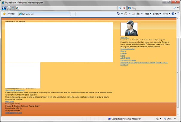
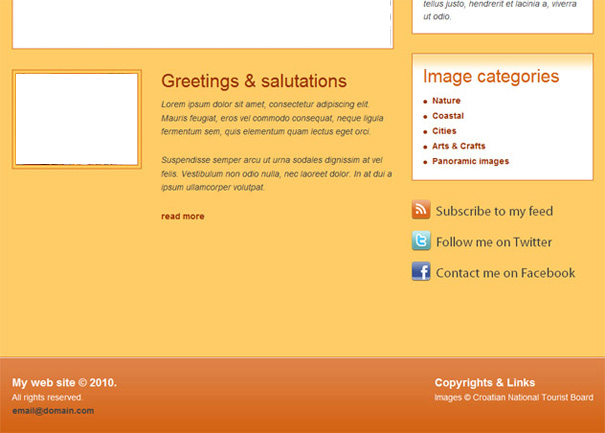
Our page now looks like this:
All the content for our page is now added and the only thing left now besides a menu, which we will add later is to style our content. This is the fun part as we will be playing with CSS all the time. 🙂
6. Styling the content with CSS
First, let’s separate our page content from the header and footer. To do this let’s simply add some top and bottom padding to our content and sidebar divs. How much? We simply go to our design in Photoshop and use the Ruler tool to measure the distance from the header to the sidebar box for instance. Anyway let’s augment our content and sidebar and content divs with padding:
#content {
float: left;
width: 630px;
margin-right: 30px;

padding: 24px 0;
}

#sidebar {
float: left;
width: 300px;

padding: 32px 0;
}
By the way, I recommend that you keep your CSS organized in some way. A good place to start is perhaps dividing the CSS into different parts: headers, images, paragraphs, etc. Let’s style all the images on our page. Add it to the end of the current CSS. Our main image has a quite simple class:
img.photo {
padding: 5px;
background-color: #ffffff;
border: 1px #d36111 solid;
}
Now let’s style other images, including the image on the “Who am I” part and the blog post image and its link. So right class is simple:
img.right {
float: right;
margin-left: 15px;
}
So HTML for our blog image looks like this:
<a href="#" class="post-photo"><img src="images/alkar.jpg" width="200" height="150" alt="Alkar Squire in the city of Sinj" /></a>
Regarding the image for a blog post, we must first style its link and then the image tag itself. Observe:
a.post-photo {
float: left;
border: 1px #d36111 solid;
background-color: #ffc757;
padding: 5px;
margin-right: 32px;
}

a.post-photo:hover {
background-color: #de834a;
}

a.post-photo img {
display: block;
border: 1px #d36111 solid;
}
It is quite simple: first, we float the entire thing, so it goes left of the blog title and text. Then we add border, margin and padding. We need the padding so that our image contained inside it is moved 5px from borders, and then we margin to move the blog text and title to the right.
Ok let’s style the box div we use on the sidebar:
.box {
padding: 18px;
border: 1px #d36111 solid;
margin-bottom: 32px;
background: #ffffff url('images/box-bg.jpg') repeat-x;
}
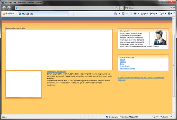
Our page now looks a lot more like in the Photoshop template:
Ok, time for styling headers and paragraphs! We will start with the h1 in the header section and then get to those in the wrap and footer areas.
#header h1 {
float:left;
background: transparent url('images/logo.png') no-repeat;
text-indent: -9999px;
width: 259px;
height: 56px;
margin-top: 32px;
}
This header is a bit special, so let me just briefly explain (for beginners’ benefit) what we did just now. What we did here is called image replacement. We move the text in the header outside the browser viewport and replace it with a background image (in our case logo.jpg). We need to specify the dimensions of our logo so it’s displayed entirely and we use the float and margin to position it where we want.
Next, we style other headers and links inside headers. First, let’s set the styles shared on all h1 tags:
h1 {
font: 3em Arial, Helvetica, sans-serif;;
color: #414141;
margin-bottom: 10px;
}
Confused by 3em? Remember what we said? When we set the body font size to 62.5% then 1 em = 10 px. So to get a font size of 30px we use 3em. Why? Simply because if we set the font size in px some browsers won’t resize them.
Anyway, let’s continue styling our headers. Now that we have set the font size and font-family for all the headers, we don’t need to set them again. Instead, those properties are inherited. Observe:
#content h1 a {
color: #993300;
text-decoration: none;
}

#content h1 a:hover {
color: #d36111;
}

#sidebar h1 a {
color: #d36111;
text-decoration: none;
}

#sidebar h1 a:hover {
color: #2469d1;
}
To style the blog post, let’s briefly remember how the HTML for it looks:
<div class="blog"> <a href="#" class="post-photo"><img src="images/alkar.jpg" width="200" height="150" alt="Alkar Squire in the city of Sinj" /></a> <h1><a href="#">Greetings & salutations</a></h1> <div class="post"> <p>Lorem ipsum dolor sit amet, consectetur adipiscing elit. Mauris feugiat, eros vel commodo consequat, neque ligula fermentum sem, quis elementum quam lectus eget orci.</p> <p>Suspendisse semper arcu ut urna sodales dignissim at vel felis. Vestibulum non odio nulla, nec laoreet dolor. In at dui a ipsum ullamcorper volutpat.</p> <a href="#">read more</a> </div> </div>
So we have a blog div which contains our entire post. We have already styled the images and links and now we just need to move it from the main image, and set the font size and line-height:
.blog {
margin-top: 31px;
}

.post {
font-size: 1.4em;
line-height: 1.6em;
float: left;
width: 384px;
}

.post p {
font-style: italic;
color: #414141;
margin-bottom: 25px;
}

.post a {
font-weight: bold;
color: #993300;
text-decoration: none;
}

.post a:hover {
color: #d36111;
}
After adding these styles, we have only one tiny problem displayed in the image below:
Our blog text now goes beneath the image, and we don’t want that for this design. Fortunately, we fix it very easily. Just slightly change the post-class:
.post {
font-size: 1.4em;
line-height: 1.6em;

/* add this */
float: left;
width: 384px;
}
And Voila! The blog is finished!
Sidebar styling time! First, let’s take care of the paragraphs:
#sidebar p {
font-size: 1.4em;
line-height: 1.5em;
font-style: italic;
color: #414141;
}
And then, let’s do the list of links in the Image categories section. First, let’s have another look at the HTML behind it:
<ul class="links"> <li><a href="#">Nature</a></li> <li><a href="#">Coastal</a></li> <li><a href="#">Cities</a></li> <li><a href="#">Arts & Crafts</a></li> <li><a href="#">Panoramic images</a></li> </ul>
So, we have a list, and inside every list item, there’s a link. How do we style it? Easy:
ul.links {
font-size: 1.4em;
line-height: 1.8em;
list-style: inside url('images/bullet.png');
}

ul.links a {
font-weight: bold;
color: #993300;
text-decoration: none;
}

ul.links a:hover {
color: #d36111;
}
Some might say: why use an image when a bullet is a simple circle? Of course, we could play with this list along these lines:
ul.links {
list-style: disc;
color: #993300;
font-size: 2.5em;
margin-left: 17px;
}

ul.links li a {
font-size: 0.6em;
position: relative;
bottom: 5px;
}
But I say, let’s keep it simple!
As for Social links on the sidebar, HTML is pretty simple:
<div id="social">
<a href="#" class="rss">Subscribe to my feed</a>
<a href="#" class="twitter">Follow me on Twitter</a>
<a href="#" class="facebook">Contact me on Facebook</a>
</div>
So it’s just a couple of links in a div. We style them like this:
#social a {
display: block;
color: #414141;
font-size: 2.2em;
padding: 5px 0 5px 40px;
font-family: "Myriad Pro", Arial, Helvetica, sans-serif;
text-decoration: none;
margin-bottom: 15px;
}
#social a:hover {
color: #d36111;
}
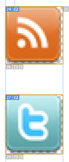
#social a.rss {
background: url('images/rss.png') no-repeat;
}
#social a.twitter {
background: url('images/twitter.png') no-repeat;
}
#social a.facebook {
background: url('images/facebook.png') no-repeat;
}
See what we did here? I hope you do. 🙂
OK let’s do the footer really quick and we’re done!
<!-- footer --> <div id="footer"> <div class="container"> <div class="copyright"> <h2>Copyrights & Links</h2> <p>Images © Croatian National Tourist Board</p> </div> <h2>My web site © 2010.</h2> <p>All rights reserved.</p> <a href="mailto:email@domain.com">email@domain.com</a> </div> </div> <!-- end footer -->
First, when we look at the design we see that we must add some padding to our footer so that our texts are not directly at the top of the footer. We will add the padding to our container class in the footer, and not to the footer itself so it doesn’t mess up our footer height:
#footer {
color: white;
font-size: 1em;
}

#footer .container {
padding-top: 30px;
}
Now we float the copyright area and add some (pretty standard no-explanation-required :P) formatting to our links and texts:
#footer .copyright {
float: right;
}

#footer h2 {
font-size: 1.8em;
font-weight: bold;
}

#footer p {
font-size: 1.4em;
line-height: 2em;
}

#footer a {
font-size: 1.4em;
font-weight: bold;
color: #414141;
text-decoration: none;
}

#footer a:hover {
color: #ffcc66;
}
And after all this what do we get? We get this:
…which means the only thing left to do now is a menu. So, let’s go!
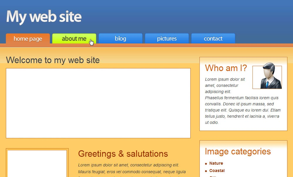
6. Adding the menu
Let’s have another look at the menu in our design:

Buttons in our menu have three states:
- Default-inactive (blue colour)
- Hover (lime colour)
- Selected or active (orange colour)
So we need three different images for a single button and a mechanism to determine which button is the selected (active) one. Right?
The image for the menu is contained in our samples.
First, let’s add the HTML for our menu to the header:
<!-- header -->
<div id="header">
<div class="container">
<h1>My web site</h1>

<!-- menu -->
<ul id="menu">
<li class="home"><a href="index.html">Home page</a></li>
<li class="about"><a href="#">About me</a></li>
<li class="blog"><a href="#">Blog</a></li>
<li class="pictures"><a href="#">Pictures</a></li>
<li class="contact"><a href="#">Contact</a></li>
</ul>
<!-- end menu -->

</div>
</div>
See, our menu is contained in an unordered list. Each of the list items has its class, which is needed for working with CSS Sprites because each link has a different part of the background image shown. For a detailed explanation of CSS Sprites, you can consult my blog entry about CSS Sprites.
Ok, first let’s style and position our list:
#menu {
width: 850px;
float: left;
height: 35px;
margin-top: 15px;
}

#menu li {
display: inline;
text-indent: -9999px;
}
As you can see we once again use image replacement for our menu because the text is contained inside our images. Ok now we need to add the default properties for all the links in the menu:
#menu li a {
display: block;
float: left;
background: transparent url('images/menu.png');
width: 150px;
height: 35px;
margin-right: 8px;
}
As you can see, we get pretty nice buttons. We now need to position the sprite image so that we get the proper text for each button:
#menu li.home a { background-position: 0 0; }
#menu li.about a { background-position: -151px 0; }
#menu li.blog a { background-position: -302px 0; }
#menu li.pictures a { background-position: -453px 0; }
#menu li.contact a { background-position: -604px 0; }

Ok, so now we get proper buttons for our menu. This stuff with the coordinates may look a bit tricky, but if you look at the patterns, you will see that it’s pretty simple. Each button starts at 151px of the previous one (of course, this depends on the Sprite image dimensions). Let’s add the hover styles now:
#menu li.home a:hover { background-position: 0 -36px; }
#menu li.about a:hover { background-position: -151px -36px; }
#menu li.blog a:hover { background-position: -302px -36px; }
#menu li.pictures a:hover { background-position: -453px -36px; }
#menu li.contact a:hover { background-position: -604px -36px; }
Hover states are done! Only one thing left to do now. If you look at the design, now we need the buttons in the menu to indicate on which page we are just now. There are a lot of ways to do this, PHP for example, Javascript or pure CSS/HTML. I choose the Javascript solution because, for a pure CSS/HTML solution, we would need to set the id or class for the body tag of each of our pages, and then insert the appropriate styles into CSS. It is in my opinion simpler to just use the javascript, and I have found just a neat little script for it here: Intelligent Navigation Bars with JavaScript and CSS
So in your favourite editor create a new Javascript file (.js) and paste the following code:
/*
Adds class „active” to current page link
*/

function setActive() {
aObj = document.getElementById('menu').getElementsByTagName('a');
for(i=0;i<aObj.length;i++) {
if(document.location.href.indexOf(aObj[i].href)>=0) {
aObj[i].className='active';
}
}
}

window.onload = setActive;
Now let’s save our file and include it in our HTML file:
<script src="script.js" type="text/javascript"></script>
When you do this, refresh the page and look at the source you should see „active” class added to the first (home page) link. So now we have a mechanism for determining which page is active and adding active class to the appropriate link. Only thing left to do now is to style our active links:
#menu li.home a.active { background-position: 0 -73px; }
#menu li.about a.active { background-position: -151px -73px; }
#menu li.blog a.active { background-position: -302px -73px; }
#menu li.pictures a.active { background-position: -453px -73px; }
#menu li.contact a.active { background-position: -604px -73px; }
Our active links need to have a bigger height so that they seem connected to the orange line below the menu:
#menu a.active { height: 37px; }
And we’re done with the menu, meaning we’re done with the entire site! Here’s what the menu looks like now:
Ok, thank you for your patience and I hope this post has been at least somewhat helpful to you. Enjoy your day!