I decided to write another blog entry and possibly use my computer for something other than running Einstein@Home 🙂 This time we’re back to Web Design and we’re going to work with CSS Sprites!
What are CSS sprites?
CSS Sprites are a neat little trick which enables us to store the graphics we need to display menus, icons or buttons in one big image while showing only a part of that image at a time. This enables us to instantly show another part of the image when we need it, thus creating the desired effect, saving bandwidth and removing image flicker. So using CSS Sprites basically means:
- Create one big image containing all the needed graphics for menus or buttons
- Display one part of the image by default
- When needed shift the image to display another part of it
It may sound a bit complicated but you’ll understand in a second. 🙂
CSS Sprite example
The Sprite image looks like this:
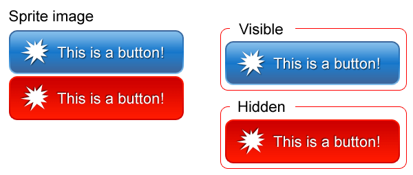
As you can see above we can create a button that is actually one big image. Then we can use CSS to display only one part at a time. So let us try and create a simple CSS Sprite hover button.
For the first step, we need to know what our button is going to look like. You can use Photoshop to create the button or you can use the button I created. You probably know how to make buttons in Photoshop so you can use this technic for the hover buttons you create personally.
Now that you have the necessary graphic let’s create XHTML/CSS needed for our button.
As you can see in this example XHTML is very simple. Just one link with one class. Class isn’t even needed but in the later examples we’ll have both classes and IDs and you better be prepared 🙂
<a href="index.html" class="button"></a>
Here is the CSS:
a.button {
    float: left;
    display: block;
    width: 254px;
    height: 64px;
    background: url(’images/your-button.png’);
}

a.button:hover {
    background-position: 0 -67px;
}
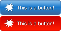
What happens is: Because of the height defined in the button class in the normal state of the link only the upper part of the background image is displayed. On hover, we shift the vertical background-position up by 67px so that it aligns perfectly with the previous button state and without „jumping”.
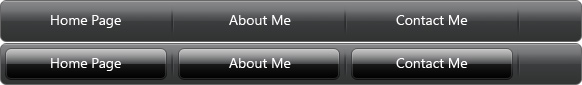
Simple menu using CSS Sprites

Now that you understand the mechanics let’s try another example using CSS Sprites for menu backgrounds. Just fire up Photoshop and create an image similar to mine which we will use for the menu background. Of course, you can also use my background.
It is pretty simple. Here’s the HTML:
<div id="navig">
<ul>
    <li><a href="index.html">Home Page</a></li>
    <li><a href="about.html">About Me</a></li>
    <li><a href="pics.html">Pictures</a></li>
    <li><a href="vids.html">Videos</a></li>
    <li><a href="contact.html">Contact Me</a></li>
</ul>
</div>
Here’s the CSS:
#navig ul {
    background: url(’menubg.png’);
    height: 42px;
    padding: 0;
    margin: 0;
}

#navig ul li { display: inline; }

#navig ul li a {
    float: left;
    display: block;
    background: url(’menubg.png’);
    padding: 12px 20px;
    font: normal 13px/18px Verdana;
    color: white;
    text-decoration: none;
    border-right: 1px solid #20799a;
}

#navig ul li a:hover {
    background-position: 0 -42px;
    color: #993300;
}
Explanation (if needed) is pretty simple. The menu is contained in list items which enable us to style appropriate ul and li so that our menu looks right. It also enables us to provide additional styling should we need it.
CSS is simple as well: first, we put our sprite image as a background for ul so it continues after links, and we define the height of ul. It is the same height as the menu buttons. Then we set display: inline for li so that LIs align one after another. Link styling is pretty simple: we use float so that links follow one another and not go in the next „line”.
Using appropriate font size, line height and padding we create menu buttons that are the same size as a part of our background image sprite. We then can use the right border to separate our buttons. On button hover, we simply shift the background image so that the lower part is now the background for our button.
Of course, CSS and HTML could be simpler but I feel this example provides additional flexibility because you can add (for example) separate CSS properties for #navig div if needed.
More advanced CSS Sprites menu
I think now we are ready for something like this:
All the sprite images and code used in this blog entry are available for download.
In some other blog entries, I plan to show you some Photoshop tricks to make buttons, menus etc. Anyway, here is the Sprite image I used for this more advanced menu:
As you can see, here we have an entire menu in one image and we use CSS to display only a portion of it when the user enters the link area. So, let’s get right into it!
The HTML:
<div id="navig">
    <ul>
        <li><a href="#" class="home"></a></li>
        <li><a href="#" class="about"></a></li>
        <li><a href="#" class="contact"></a></li>
    </ul>
</div>
As you can see HTML is not that complicated. Like the previous example, it consists of a list with links. The only difference is that now each link has an additional class to it. So the link for home has a class „home” set, etc.
The CSS:
#navig ul {
    width: 582px;
    height: 42px;
    padding: 0;
    margin: 0;
    background-image: url(’sprite.jpg’);
}

#navig ul li { display: inline; }

#navig ul li a {
    background-image: url(’sprite.jpg’);
    float: left;
    display: block;
    width: 162px;
    height: 32px;
    margin: 5px 6px 5px 5px;
}

#navig ul li a.home { background-position: -5px -5px; }
#navig ul li a.home:hover { background-position: -5px -48px; }

#navig ul li a.about { background-position: -178px -5px; }
#navig ul li a.about:hover { background-position: -178px -48px; }

#navig ul li a.contact { background-position: -351px -5px; }
#navig ul li a.contact:hover { background-position: -351px -48px; }
CSS is a bit more complicated. First, we define the width and height of our list and then we use our sprite for its background. This is needed because there are parts of the graphic which are not parts of a link but we need them to be visible because they are part of the menu interface.
Next, we set properties that all our links have in common, such as display, float, width, height and margin properties. We need margin properties to determine which parts of a background image are actually buttons and which are just button separators and menu graphics.
Important note: In our example width and height of all menu buttons are the same. If you want your buttons to have different widths and heights you must set those properties in their respective classes (home, about, contact).
Next, we just tell all the buttons which part of our Sprite background image to show, and we set the same for their hover effects. It can be a bit complicated to get the exact „coordinates” right so keep at it. 🙂
It doesn’t take a lot of imagination to see that besides normal and hover you could also store „active” or „selected” states of links in CSS sprite images and display them using CSS.
Conclusion
CSS sprites are very useful. They help us save bandwidth by reducing the number of HTTP requests and to create a flicker-less menu and image effects. You can download the full samples we created here and I expect to update the Multimedia section soon with some other Sprite images and their PSD source files.